
It’s a reminder that oftentimes the best rebrands are about restraint.

Jif just rebranded for the first time in 30 years, and it’s a (rare) example of how to modernize a beloved brand without killing its quirk.
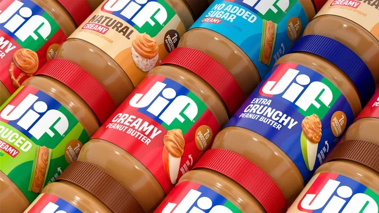
The updated branding will appear across all of Jif’s products starting this fall, and includes a new wordmark, logo, fonts, and photography. On August 10, Jif dropped a new campaign called “Every Jif’ing Thing,” which highlights the spread’s many use cases—think smoothies, yogurt bowls, and peanut noodles. Together, these efforts are part of a broader repositioning plan from Jif.
The brand told Marketing Dive that while 85% of consumers could recognize the Jif logo by its red, blue, and green stripes, they mostly associated it with peanut butter and jelly sandwiches. As Jif works on expanding its product portfolio into new innovations like squeezable tubes and peanut butter and chocolate spread, the brand’s new look is meant to convey that it’s not just a component of your kids’ favorite sandwich—it’s also, per a press release, “a natural complement to an apple slice, rice cake, cracker, or even simply enjoyed from a spoon” (we’ve all been there).
In an era when brand refreshes
In an era when brand refreshes are in vogue, what stands out about Jif’s evolution isn’t what’s changed, but what’s stayed the same. The brand has smartly taken an ultra-subtle approach with its wordmark, and, by staying true to its funky lettering, it manages to look more modern without losing recognizability.
Refreshed leadership advice from CEO Stephanie Mehta
An Inc.com Featured Presentation

Jif gets a beyond-PB&J glow-up
In 2023, Fast Company declared it the era of the “big rebrand.” In 2024, the rebrand was dead, replaced with the “refresh”—ostensibly the same concept, with a lighter, less all-encompassing touch. Today, companies are still much quicker to update their branding in a bid to stay modern than they are to hold off to maintain brand recognizability.
When it comes to logos, that can mean sacrificing established brand equity (as in the case of Eddie Bauer, Saint Laurent, and Johnson & Johnson) for the sake of modernity or legibility. Jif—which is one of the brands owned by massive $14 billion food and beverage conglomerate J.M. Smucker—had the built-in advantage that its 30-year-old logo was already in a bold, easy-to-read font (no pesky scripts here). Still, the previous look had plenty of quirks that the brand could easily have smoothed out in service of a sleeker identity.
The jot above the “i” was comically oversized and squished; the stems of the “J” and “f” were so chunky that only a sliver of space poked in between; and the crossbar of the “f” was disproportionately thin and short.
Source: www.inc.com