

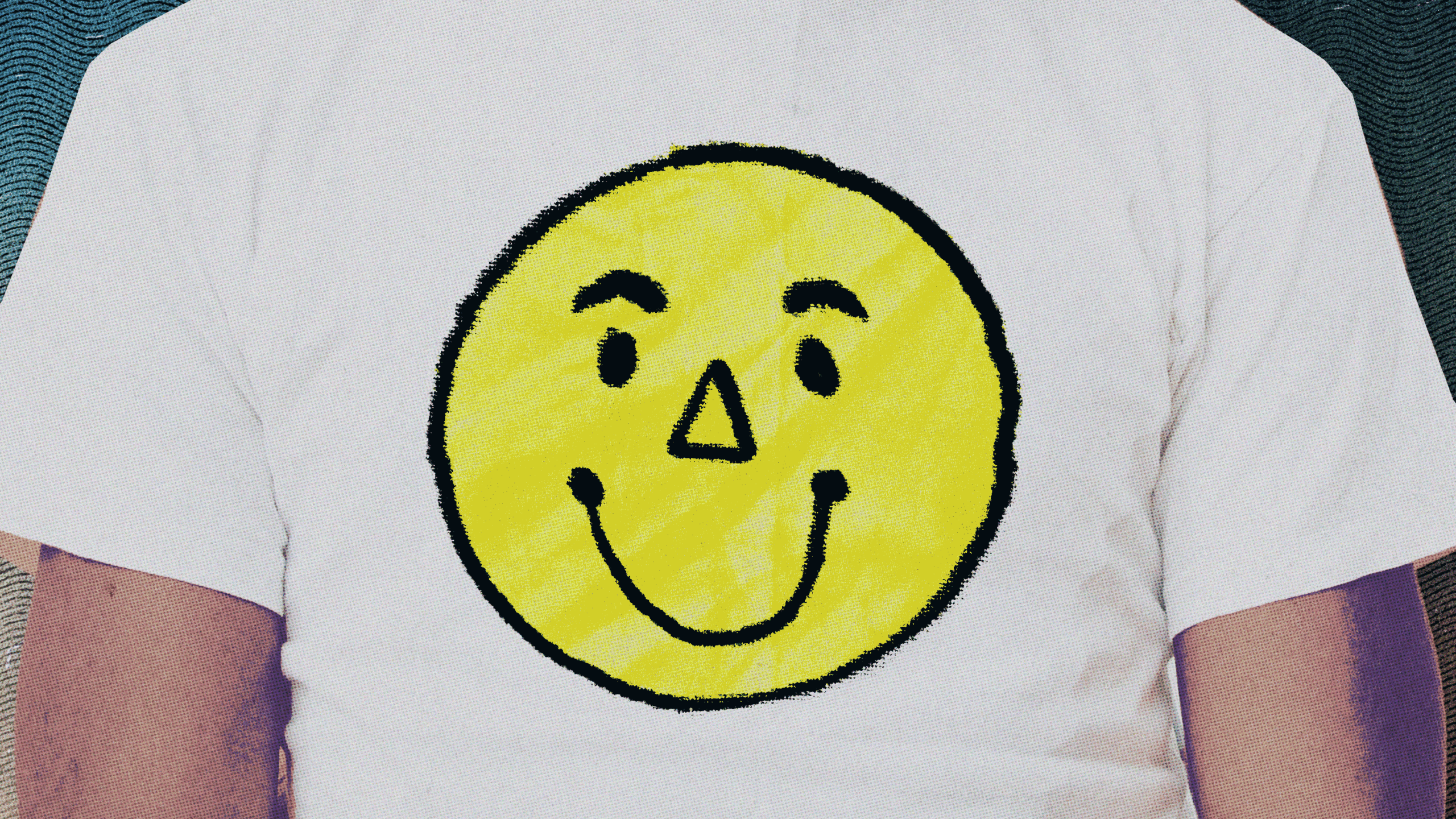
The humble graphic T-shirt is in the midst of a much-welcomed renaissance. Following the yearslong reign of coy, understated basics, it feels like stylish people are ready to wear their personalities on their chests again. But beware: The world is awash in bad graphic T-shirts. From the “Fuck You You Fuckin’ Fuck” shirts populating tourist shops across Chinatown and Little Italy to the corporate giveaway tees clogging Ghanaian landfills, there is perhaps no other garment that better embodies humankind’s tendencies towards poor taste and wastefulness.
But suckiness is in the eye of the beholder, and the difference between a terrible graphic tee and a great one is often a matter of perspective. Emily Manning, a Brooklyn-based artist and a feverish collector of Cape Cod-themed tees, has a knack for turning tourist slop into treasure. Recently, Manning, a Massachusetts native, partnered with artist Payton Barronian to revive fifty pieces of discarded Cape Cod, Martha’s Vineyard, and Provincetown merch, which they sold at the culty Lower East Side vintage store Procell.
Their approach was tender and entertaining. Looking through Peter Hunt’s Cape Cod Cookbook from 1954, Manning spotted a bow illustrated by Hunt, a Provincetown artist and furniture painter. She reinterpreted the bow as a glitter appliqué, then Barronian splashed it across tops that read “Cape Cod” in otherwise generic, varsity-style letters. “If I turn it inside out, if I throw a little bleach on it, if I do this and that, they become something that I feel more connected to,” Manning says.
It becomes this new, very special thing
“It becomes this new, very special thing to me out of something I could just go find at any fricking thrift store at home.”
For Artem Emelianov, owner of World Vintage, the celeb-frequented Downtown Los Angeles warehouse, the worst kind of graphic tee says as much about the person who made it as the person who’s wearing it. “A bad graphic tee is something that was just made quickly without much thought or emotion or a purpose, mostly to make money,” he says.
“Mimicking things on Instagram for a quick dollar.”
Conversely, he says, “Some tees that most people would think are bad, for me, are good.” These can be unremarkable designs redeemed by wear—“fading, cracking in the print, or crooked placement”—with the exception of those produced using faux distressing methods, which automatically place a tee in the objectively bad category.
His favorite tees advertise local businesses: mechanics, plumbers, delis, and small bars. “They maybe made 50 shirts without a professional designer, just for their community. I love finding these,” he says. Conversely, he says, “Some tees that most people would think are bad, for me, are good.” These can be unremarkable designs redeemed by wear—“fading, cracking in the print, or crooked placement”—with the exception of those produced using faux distressing methods, which automatically place a tee in the objectively bad category.
His favorite tees advertise local businesses: mechanics, plumbers,
His favorite tees advertise local businesses: mechanics, plumbers, delis, and small bars. “They maybe made 50 shirts without a professional designer, just for their community. I love finding these,” he says. “Especially from the ’70s or ’80s, they tend to have a bit of a sense of humor in their design or the tagline.”
Lukas Fracher, owner of Luke’s Vintage in Los Angeles and NYC, is similarly inclined.
Many of the tops in Fracher’s stores find their value in the lived life they hint at through their signs of wear, like a plain but deeply worn-in Nike shirt that once sat overlooked in his store. “It was a really smoked-out long-sleeve, just a Nike shirt with a Nike logo, and the collar kind of ripped up,” he says. He decided to start wearing it. On him, it struck a different tone from on the rack, and customers began to ask about buying it.
This speaks to another factor that disrupts the inherent goodness or badness of a shirt’s design or quality: context. Another one of Fracher’s most-commented-on shirts came from an employee who inherited the simple white slogan tee from their dad. He sold it to Fracher, who, for reference, is a white guy with a propensity for teeny, slutty oval-shaped glasses and sweatpants.
It reads: 1993 Detroit Islamic Conference
It reads: 1993 Detroit Islamic Conference. “The funny thing about a really good graphic tee is that a lot of people don’t have the imagination to know how good something is when they’re looking through a rack or looking at a pile of clothes,” he says. “They have to see someone wearing it to maybe get it re-contextualized in a way that makes sense to them.” On Fracher, a piece of commemorative merchandise from an Islamic conference underscores a campy sensibility.
Fittingly, he’s previously worn it coexist-style with a baseball cap that reads “JESUS” in big, bedazzled letters. “I think my whole spiel with my brand and these designs is humor,” admits Emily Dawn Long, whose graphic tees have come to signal a certain playfulness among menswear guys. Printed on deliciously broken-in and sun-faded shirts, the inspirations behind the slogans and motifs Long creates are often self-referential and movie-based.
Her popular “Take Off Your Clothes” shirt finds its origin in 1988’s The Unbearable Lightness of Being, a command Daniel Day-Lewis nonchalantly utters as he chomps on an apple. Currently, her site boasts a batch of tees that read “Bug Me”—a reference to her catchphrase and the ubiquity of ladybugs in her life. People find their own meaning in Long’s semi-autobiographical slogans, which she likes.
Everybody has a different connection with it, she
“Everybody has a different connection with it,” she says. But irony isn’t for everyone. Most of the guys I spoke with came by their love of graphic T-shirts earnestly. Whether in an effort to emulate an older brother by repping his favorite heavy metal band or to signal solidarity with fellow skatersan Shahvali, owner of Intramural Shop in New York City
“When you see someone from your tribe, quote-unquote, wearing this very specific niche graphic, you understand them pretty quickly,” he says, referring to the Supreme shirts he wore and spotted on others growing up. “If I see you wearing a box logo shirt in 2006, I’m like, ‘This guy gets it.’ But if I see you wearing, I don’t know, something like Balenciaga, it just doesn’t mean anything.”
He’s admittedly skeptical of irreverent designs, citing the cultural hollowness of 2010’s popular “Spiritual Gangster” shirts and referring to Abercrombie & Fitch’s brand of cheek—which, in the early aughts, included several racist slogans—as “the worst kind of graphic tee.” When scouring flea markets and vintage bins for rare finds, Chad Senzel, owner of an eponymous vintage store, says he skips items that are too silly: intramural sports shirts and family reunion memorabilia, specifically.
Senzel also tends to toss tees with team logos, a genre of shirt Fracher similarly finds uninteresting. “I think sports are the lowest common denominator of clothing,” Fracher says, but admits that sentiment might be biased given that he doesn’t “think sports are that cool, generally.”
Donning popular iconography can have the adverse effect of flattening one’s personality.
As Emelianov said of Pink Floyd’s Dark Side
As Emelianov said of Pink Floyd’s Dark Side of the Moon album cover, “They’re at Walmart now, so it doesn’t really hit.” Or Fracher’s assessment of seeing someone in an Urban Outfitters NASA tee: “[It] says that ‘I don’t give a fuck about clothing.’” Likewise, the trend of giant brands partnering with the estates of beloved artists from Van Gogh to Keith Haring.
“It’s like the importance of Keith Haring has been tainted by the fact that his art is printed on so many Uniqlo T-shirts,” Senzel says. Altering an iconic (if not overplayed) logo is a delicate balance, but can effectively combat its oversaturation if done correctly. Consider Milton Glaser’s I ♥ NY design. Most New Yorkers wouldn’t wear it, though they can recognize the design’s ingenuity.
But taking the same I ♥ formula and applying it to a city that isn’t as powerful as New York feels subversive. A few years ago, my girlfriend visited Thailand. She brought back a perfect white tee that read, in the same typewriter font, I ♥ BANGKOK. It’s one of my favorite shirts. I’ve since bought an I ♥ MALTA tee and am currently on the hunt for a Cuzco iteration. One way to signal your admiration for a popular artist without recycling the same imagery is to zero in on a specific moment in time—a particular tour stop or a limited exhibition run.
Nobody that I know is ever going
“Nobody that I know is ever going to own a Picasso, a Matisse, a Pollock, an Andy Warhol,” Senzel says. He’s particularly skilled at finding vintage museum merchandise. “It feels attainable, and in many regards, just as cool, to wear a T-shirt from a David Hockney retrospective at LACMA in 1987. It feels almost as good as having a David Hockney on your wall.”
The instinct to promote gets a little hairier once the subject isn’t an artist but you.
Though the graphic T-shirt’s raison d’être is to broadcast a certain aspect of one’s taste, identity as an accessory is something I’m inclined to resist. Political shirts earn their keep in the run-up to an election—Mayor Mamdani’s supporters put their heads together to create some great ones last year—but unnecessary after the fact. (There are exceptions: a coworker recently relayed to me that he’s on the hunt for a “10,000 Holes Filled” T-shirt, a reference to Mamdani’s recent pothole blitz.) The same goes for very obvious community markers, like an Etsy T-shirt that reads in big, bubbly, rainbow-festooned letters, “Sounds Gay, I’m In.”
Visibility still matters, though, and there are sharper ways to wear heritage, orientation, or politics than going for the obvious identity marker.
Cliché T-shirts are par for the course during Pride month. But this year’s parade of gay-themed tees surprised me with their nuance. After spotting it on a friend, I ended up buying an incredible one by the cinephile brand, misc-en-scéne, which reads: LYDIA TÁR INNOCENT. “The key to a good graphic tee is some restraint or subtlety,” Shahvali agrees. “You want to leave a little room for interpretation and for someone to ask, ‘Why are you wearing that shirt?’”
Source: www.gq.com