World map may change: UN votes today on map showing Africa larger, while Europe, Russia and Canada appear smaller

- English News
- International
- UN Vote To Change World Map: Africa Size Increase & Europe Shrink | 2026
- Copy link
From childhood, the world map we have seen in books, on TV and on the internet has shown the size of many countries and continents quite differently from their actual size. Now, there is an effort to change this.
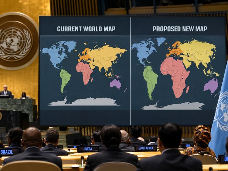
The United Nations General Assembly will vote on the proposal on Friday. It calls for adopting a world map that shows the size of countries and continents closer to their actual land area.
If the proposal is approved, the world map could look quite different. Africa and South America would appear larger, while Greenland, Europe and Canada would look smaller than they do on the current map.
The campaign for this change was started
The campaign for this change was started by some African countries. They say the current map has long shown Africa as much smaller than its actual size.
What is the problem with the current map?
One of the most widely used maps in the world is the Mercator map. It was created in 1569 by European mapmaker Gerardus Mercator.
One of the main advantages of this map is that it is useful for planning sea routes and navigation. However, because it shows the round Earth on a flat map, the size of countries and continents can appear different from their actual size.
As an area moves further away
As an area moves further away from the Equator, it appears larger than it really is on the map. This is why many areas in the northern and southern parts of the world look much bigger than they actually are.
Greenland is the most well-known example. On the Mercator map, Greenland appears to be almost the same size as South America. In reality, there is a huge difference between their sizes.
Greenland has an area of around 2.2 million square kilometres. This is roughly the same size as the Democratic Republic of Congo. Africa, meanwhile, covers around 30 million square kilometres. This means Africa is about 14 times larger than Greenland.
Yet, when looking at a Mercator map,
Yet, when looking at a Mercator map, the two can appear almost the same size. This is the difference that the new campaign is trying to reduce.
African countries raise questions
African countries say the issue is not just about a country or continent appearing smaller or larger on a map. The world map also affects how we view different parts of the world.
The proposal submitted to the UN says the Mercator map makes Africa appear much smaller than its actual size. Seeing this image for a long time can create a wrong impression about Africa’s size and its importance in the world.
The proposal also mentions Latin America and South
The proposal also mentions Latin America and South Asia. It says that these regions appearing smaller on maps can create the impression that their development needs, infrastructure and economic potential are also less important.
A more accurate picture of the world could now emerge
The proposal submitted to the UN is called ‘Correct the Map’. It has been promoted jointly by member states of the African Union and the Bahamas.
It calls for using maps other than the Mercator map that show different parts of the world closer to their actual land area.
The ‘Equal Earth’ map is particularly important
The ‘Equal Earth’ map is particularly important. It was introduced in 2018. Its aim is to show the size of countries and continents closer to their actual area on Earth.
The changes are visible at first glance…
- Africa appears much larger.
- Brazil and South America also appear larger.
- Greenland becomes much smaller.
- Europe also appears smaller compared with the current map.
In other words, nothing changes on the ground; only the way it is shown on a map changes.
France also supports the new map
France has also backed the campaign. French Foreign Minister Jean-Noël Barrot said on Friday that his country would use maps in which the size of countries and continents is closer to their actual land area.
He said the current map makes countries such
He said the current map makes countries such as the US, Russia and China appear larger and more prominent than Africa, Latin America and Southeast Asia.
Barrot said that repeatedly seeing this difference on maps can gradually influence the way people think. He said the time had come to show the world more accurately on maps.
Africa changed its own map first
Africa is not only complaining that it is shown as smaller on the world map. It has already started the process of changing this itself.
In March, the African Union decided to adopt
In March, the African Union decided to adopt the Equal Earth map. In April, Togo, on behalf of the African Union, appealed to UN member states to also adopt such maps.
So the effort is no longer limited to changing maps of Africa. African countries want maps used around the world to show the size of continents more accurately.
Initial discussions on the issue were held at the UN General Assembly in July, and the proposal has now reached the voting stage.
African Union Commissioner Amma Twum-Amoah said in March
African Union Commissioner Amma Twum-Amoah said in March that Africa had long been shown as smaller than its actual size on maps. She said the time had come for the world to see Africa not only according to how it appears on a map, but also through its history, culture, economy and global role.
New Zealand has also had problems with the old map
Africa is not the only region unhappy with the old map. New Zealand has also joked for years about its position on world maps.
In 2018, a tourism advertisement from New Zealand featured then-Prime Minister Jacinda Ardern. It humorously showed how New Zealand seemed to disappear from many world maps.
On the Mercator map, New Zealand appears
On the Mercator map, New Zealand appears at the far bottom right. In some maps, it can even be left out completely.
Some versions of the Equal Earth map bring Oceania closer to the centre. This makes the position of countries such as Australia and New Zealand appear more prominent.
Will Google Maps also change?
The issue is not limited to maps printed on paper.
Today, most people see the world on mobile phones and computer screens. Digital maps such as Google Maps also use different projections to show the Earth.
The UN proposal has also called on technology
The UN proposal has also called on technology companies to adopt more accurate maps and work with member states and regional organisations.
However, this does not mean that Google Maps or every map in the world will change the day after the proposal is passed. Different organisations and countries will have to make their own decisions.
So, will the world map really change?
If the UN General Assembly approves the proposal, it will not mean that a single new map will become compulsory around the world.
It could encourage the use of methods
However, it could encourage the use of methods in map-making and education that show the actual size of countries and continents more accurately.
The world itself will remain the same. Africa, Greenland, Europe, South America and India will all stay where they are. The only difference will be that their appearance on maps will be closer to their actual size on the ground.
Source: www.bhaskarenglish.in